Tuesday, 12 May 2020

EXP 2 Technicalities

Animation:

Moving Parts:


Lumion File: 

Sketchup File:
https://www.dropbox.com/s/3zpdd72mjtmnv1c/Jenny%20Lower%20Campus_FINAL.skp?dl=0


NOTE: The images uploaded can't open up as individual photos, so I made the images very large when viewed on the blog.


End.

Final EXP 2 Submission


My architectural design revolves around designing tectonic elements which fulfil two purposes - for structural support and for aesthetic value in transparently revealing the physical structure.

Aerial View of Faculty
As such, the glass facades which adopt the sharp transparent texture allow for light imprints adhering to the shapes onto the floors and surroundings on the buildings. This represents the fragility of the human mind which is allowed to roam free with no boundaries. 

Aerial View
The concrete elements which surround the three buildings as well as the interior walls separating spaces are cut out in a rough manner as to add to the rawness and potency of the design.  

The amalgamated effect of these material elements as well as the interconnected nature of this faculty thus enforce the complexity that is in the human nature.

Top View showing pathway connections to Squarehouse and the Terraces as well as ground connections to the Gym and Aquatic Centre and Roundhouse


View of ground connection to Recreational Lawn, outdoor resting area in view


View of pathway connections to other buildings and to lower campus


Aerial View of Buildings and Textures 
The moving elements are the tectonic supports about the buildings which adopt the rotational texture and the tectonic plates on the pathway connections which accentuate the linear pedestrian movement. 


Aerial View of Buildings and Textures


Ground View from Recreation Lawn


Ground Level of Main Building - Common Area


First Level of Main Building - Research space


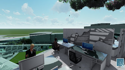
Second Level of Main Building - Computer labs


Third Level of Main Building - Library


Lower tier of Library - Book space


Upper tier of Library - Study space


View of the connection between Main Building and Second Building


First Level of Second Building - Common Area


Aerial View of Second Building


Second Level of Second Building - Workshop space onlooking ANZAC Parade


Workshop space - 3D printing area


Third Level of Second Building - Tutorial room


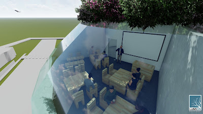
Third Level of Second Building - Lecture Theatre


Ground Level of Staff Building - Admin office


First Level of Staff Building - Breakroom


Second Level of Staff Building - Teaching Staffroom 


End. 

Friday, 24 April 2020

Textures

Here are the 36 textures. The three words that relate to movement are gradual, sharp and rapid


The textures chosen are shown below. 


Linear

Rotational

Sharp
These have been implemented on the moving elements which move in that manner. 


The exterior building supports rotate about the buildings, and the exterior plates move linearly on the pathways connecting the buildings to each other as well as to the campus itself.  


The sharpness that is applied on the glass facades of the buildings demonstrate how fragile the human persona is and how we must support each other through the interconnectedness of the community as to uplift our spirits and minds.


____________________________________________________________________________

Peer Reviews:


End.

Design Theory

The article that I read to develop my design theory was A.N. Furnam's The Freedom of Aesthetics (2018). 

Through this article, Furman speaks about how a growing stylistic consensus in architecture restricts the full expression of human complexities, and he encourages architects in the modern age to overcome this social restriction and strive for greater artistic freedom. 

Furman, Adam Nathaniel. "The Freedom of Aesthetics." Architectural Design, 88 (April 2018): 68-75. https://doi.org/10.1002/ad.2303


The keywords I have chosen from this article are: 
freedom
human complexities
raw

I also gained interest in tectonic architecture, which is the art of construction in relation to both the use and artistic design. Features include the design of non-monolithic structures and the incorporation of different materials and techniques. 

From this, I have developed the following design theory which relates to movement:

"Tectonic architecture is a freedom of raw brilliance as it allows for the embrace of disorderly complexities pertaining to the human experience and expresses this in strengthened material support."

End.

GIFs

To portray my design, I have made GIFs, one showing the opposite point of view of the other.

Axonometric View Diagram

Two Point Perspective Drawing

The three buildings are represented as three positive blocks, two of which are hollowed out by negative rectangular prisms and connected by another positive one.
Axonometric View GIF

Two Point Perspective GIF


End.

Sunday, 5 April 2020

Plan to Section

The plan that I have chosen to adapt is Jeremy Bentham's Panopticon.


So, I have developed my design so that it'd consist of three buildings. 


The main building would have connections to the smaller buildings and to surroundings structures on the lower campus. 


End.

Thursday, 2 April 2020

Perspective Sketches and Massing

Here are the one-point perspective drawings of the circulation cross. 


The data that I previously calculated for the size of the spaces has been revised in mind of the meeting from last week. The corrections are the downsizing of the lecture theatre, the studios/tutorial rooms, workshops, research spaces, and offices.

I have decided that I shall design for the Faculty of Built Environment, so the spaces in mind would be suited for design and architecture students. 

The types of students would span across different years - from undergraduate to postgraduate and research students, as outlined in the dataset below.

Moreover, I have drafted up two further versions for the bubble diagrams. Version 1 retains a rectilinear form while Version 2 holds more of a curvilinear form. These have been drawn to help me figure out which direction my design is heading towards in the future.  
Third Level


Second Level


First Level

As I am still at the stage of developing the massing of the circulation cross, I am yet to choose which of the two versions I will further as a design. I instead have enforced the splitting of the spaces into three levels of the cross in developing my circulation cross design. 

 The first level is in yellow, the second level is in orange, and the third level is in red. 

Here is the image that was rendered on Lumion. 


End.